Information Architecture
UI design
Visual design
A little bit of back story...
HiveWise is the rebranded redesign of a "group-brainstorming" software formerly named the Deliberatorium. When we were approached with this challenge, the Deliberatorium was a research prototype developed to addresses the ineffectiveness of current brainstorming technology.
“Current open innovation technologies fail badly when dealing with complex problems and large groups. The fundamental challenge, ironically, is super-abundance: crowds generated so many ideas that it becomes difficult to manage the process and harvest the best ideas.”
Defining the challenge...
The platform had been tested with with several large groups including Intel, the Federal Bureau of Land Management, and the Italian Democratic Party. These tests served as an effective proof of concept, but tester feedback indicated that the structure was difficult to understand, and the UI would need to be overhauled for the platform to achieve commercially viability.
100%
Users interviewed indicated that the layout and style of the interface discouraged them from engaging with or understanding the platform.
“It has a learning curve that people may not be willing to invest in. It’s also not beautiful and so many interfaces are beautiful and fun to use.”
“The ‘look’ is the biggest issue with the Deliberatorium. When you look at the Deliberatorium you think PC, but it should be MAC.”
On the shoulders of giants...
The Deliberatorium aims to increase the efficiency of mass-brainstorming efforts by minimizing redundancy and promoting meaningful conversation using structured content categorization and hierarchy. This gives both users and researchers the ability to spend less time sifting through unorganized information, and more time ideating and building consensus. It also leaves little room for the unproductive, and often abusive discourse that internet message boards are known for.
Because of the complex structure necessary to the Deleberatorium's core function, preserving and effectively reframing that structure was a major priority for the redesign.
Finding the friction...
Moderators from the original test groups indicated that only a small fraction of posts required editing, but it's not foolproof. For this reason, the Deliberatorium required that moderators approve each post before it can be published. This creates frustratingly long wait times before users can see their posts, and these wait times become longer as engagement increases.
Designing for scalability...
To solve these problems, it was necessary to redefine the function of the moderator. By implementing advanced text recognition and basic community-driven content flagging, users who are producing well formulated content can post with little to no friction, and users whose posts need editing can receive prompt moderator feedback.
Assembling the pieces...
With the foundation set, the challenge was to design an interface that Our users could effectively navigate and interact with. We analyzed the flow and layout of competitors in both the "collective intelligence" and data organization markets, but there were very few systems that deal in content hierarchy and interactivity in a way that is both effective and user friendly.
Taking Shape...
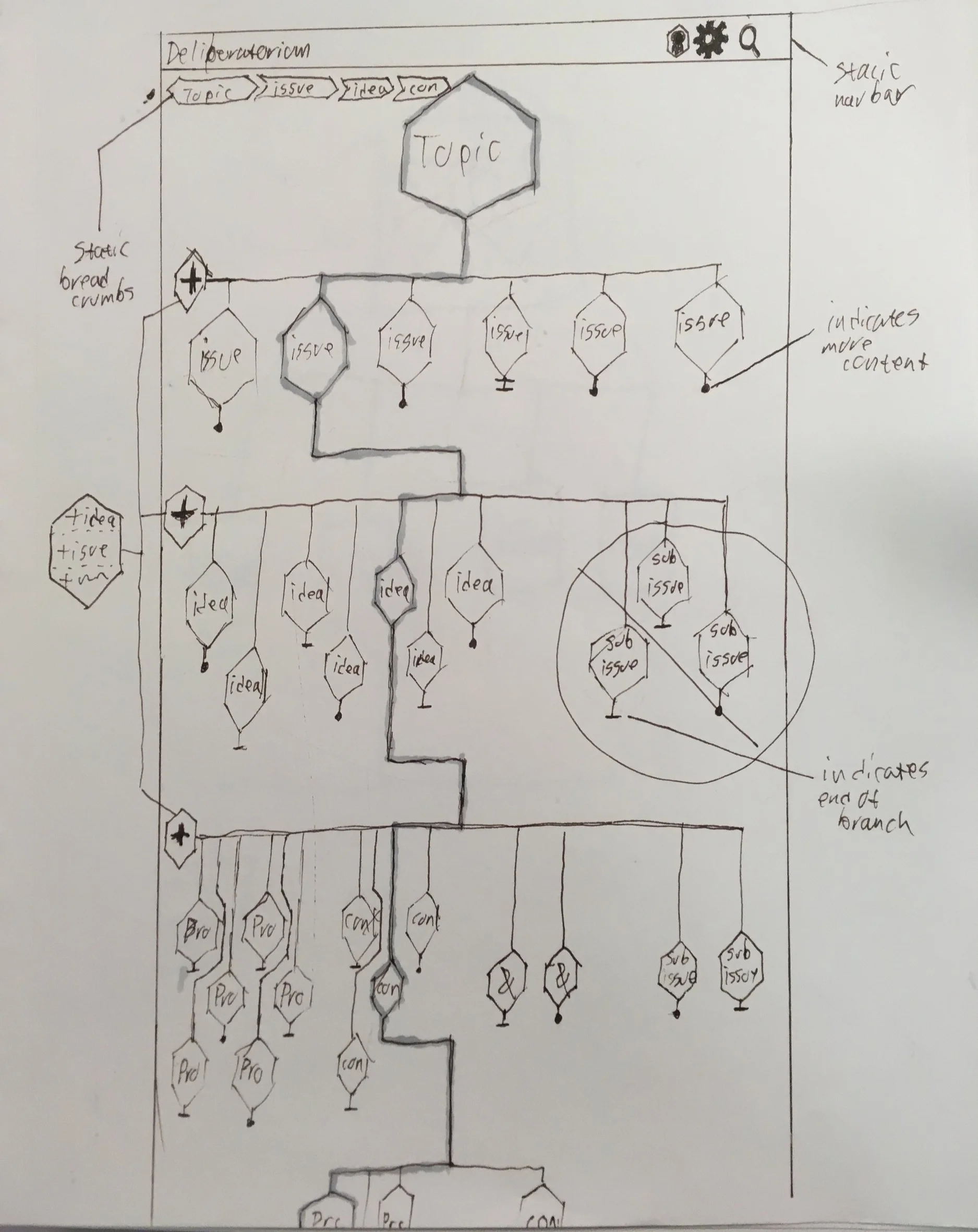
We spent a long time throwing ideas against a wall to see what would stick, but success was limited. The UI problem was compounded by the realization that our users had wildly differing opinions on what flavor of UI they prefer. The largest group of users were interested in a UI where every piece of content is treated as an object within the hierarchy to be interacted with. Researchers and academics Indicated that they preferred a layout that was more like the original with a single nested list, where they have the ability to see all of the content organized in one place. A third group, the "tactile learner" preferred a map, something spacial and interactive to be explored.


